Astro · R/GA
Astro Tribe TV
A regional streaming app for Astro, Malaysia's largest pay-TV operator. We built it around the two things its viewers actually show up for, live sport and Korean drama, and made it the first streaming app to put social connection at the center of watching.
Objective
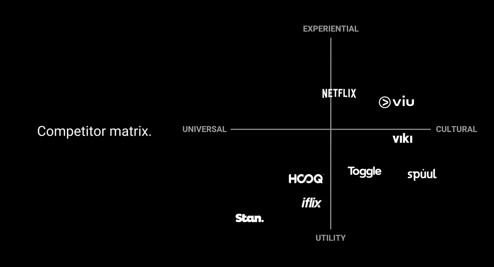
Astro is one of Southeast Asia's biggest content providers, built on satellite TV. As Netflix pushed into Indonesia, the question got sharp: how does an incumbent broadcaster win the new streaming category? I drove the answer, anchor Tribe on two pillars, live sport and Korean drama, rather than compete on catalogue size.
I led the UX end to end, from research and concept to the design system underneath. Where the safe move was a broad, do-everything catalogue, I argued the focus to the Astro team and owned the outcome, opinionated over forgettable.
The insight
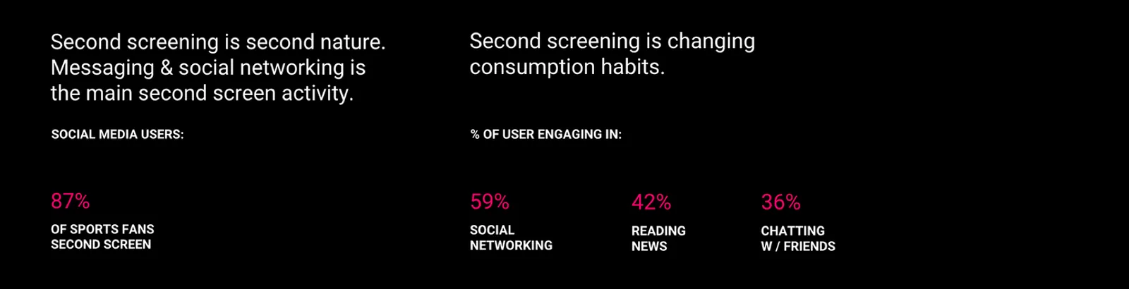
People already watch with a second screen in hand.
We got there by research. In Kuala Lumpur we interviewed the Astro team and audited the real content library, which surfaced the two anchors: live sport and Korean drama. Studying the fans, community sat dead center of both, fan sites and forums buzzing. Content and community already lived side by side everywhere but the app itself. That was the opening.
Watching, made social
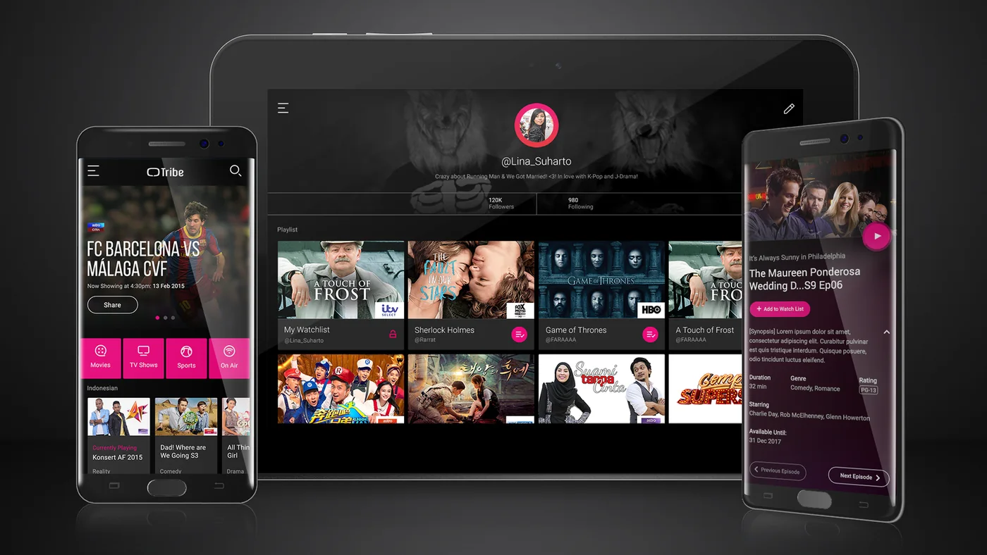
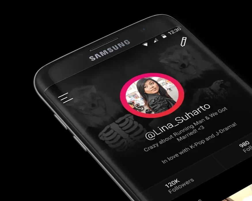
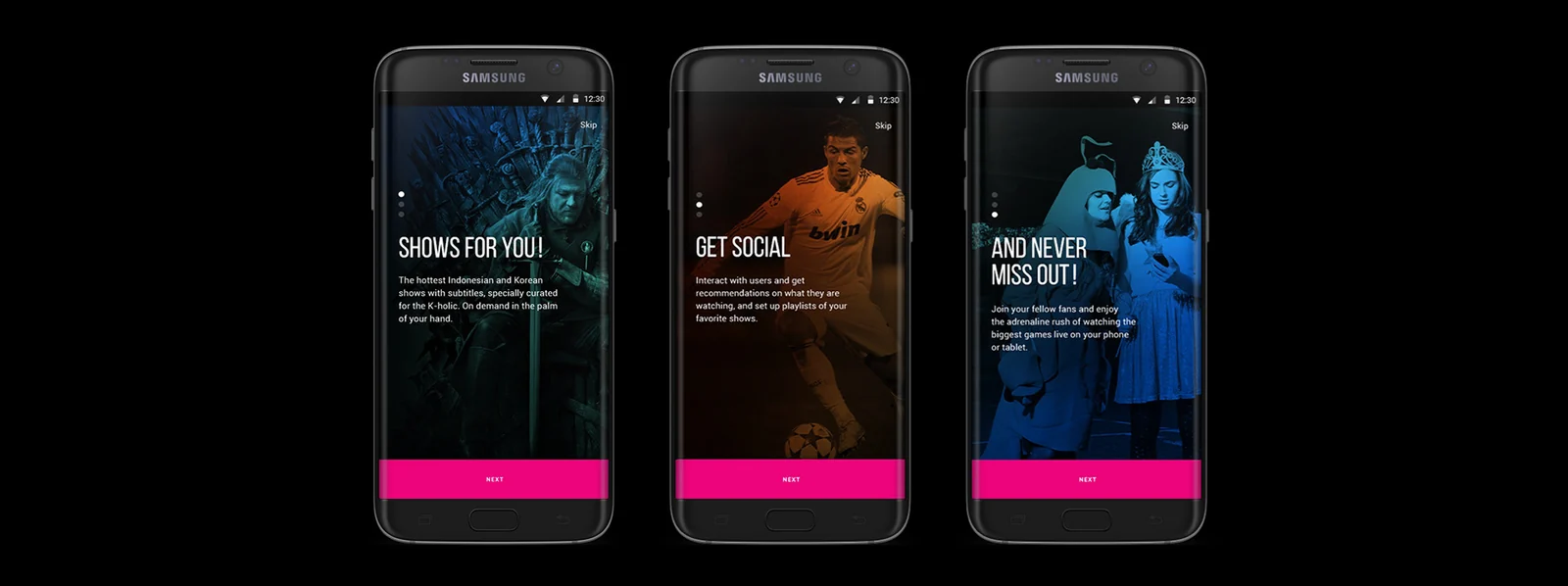
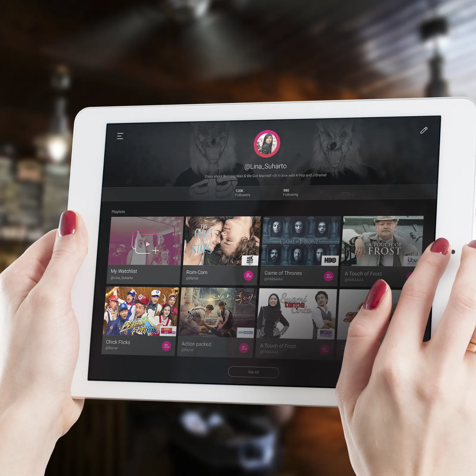
Superfans already gathered on fan sites and forums; the app was the one place they couldn't. So Tribe added real social connections between users: follow other people's playlists, see what they recommend, and follow the actors and celebrities you care about. It turns a private library into something you share.
One experience, every screen
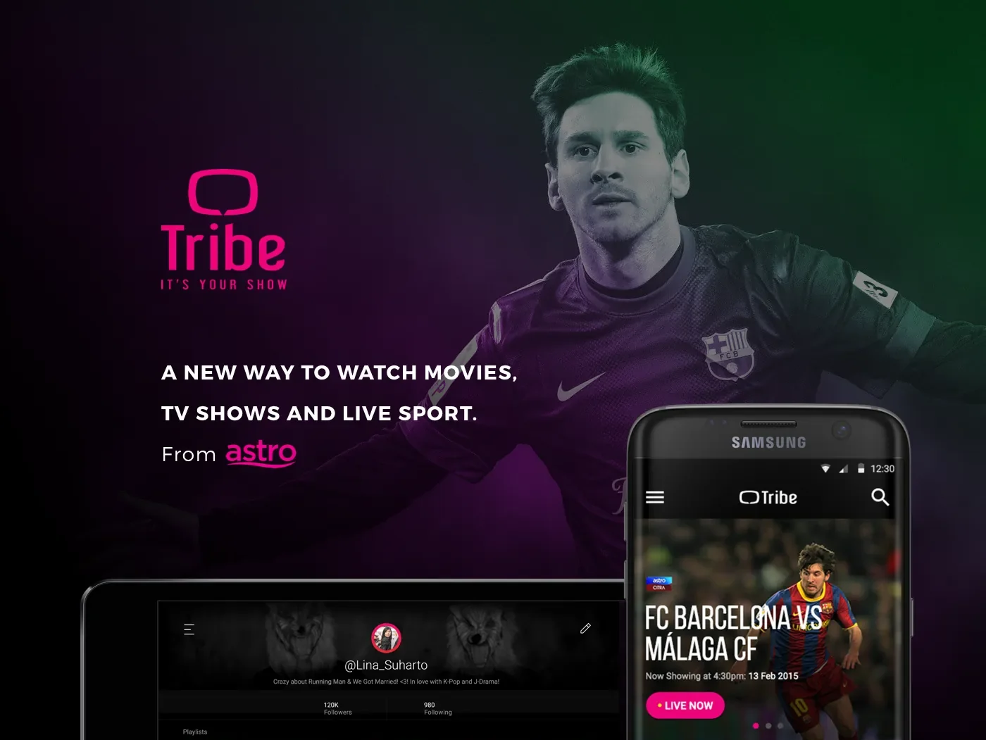
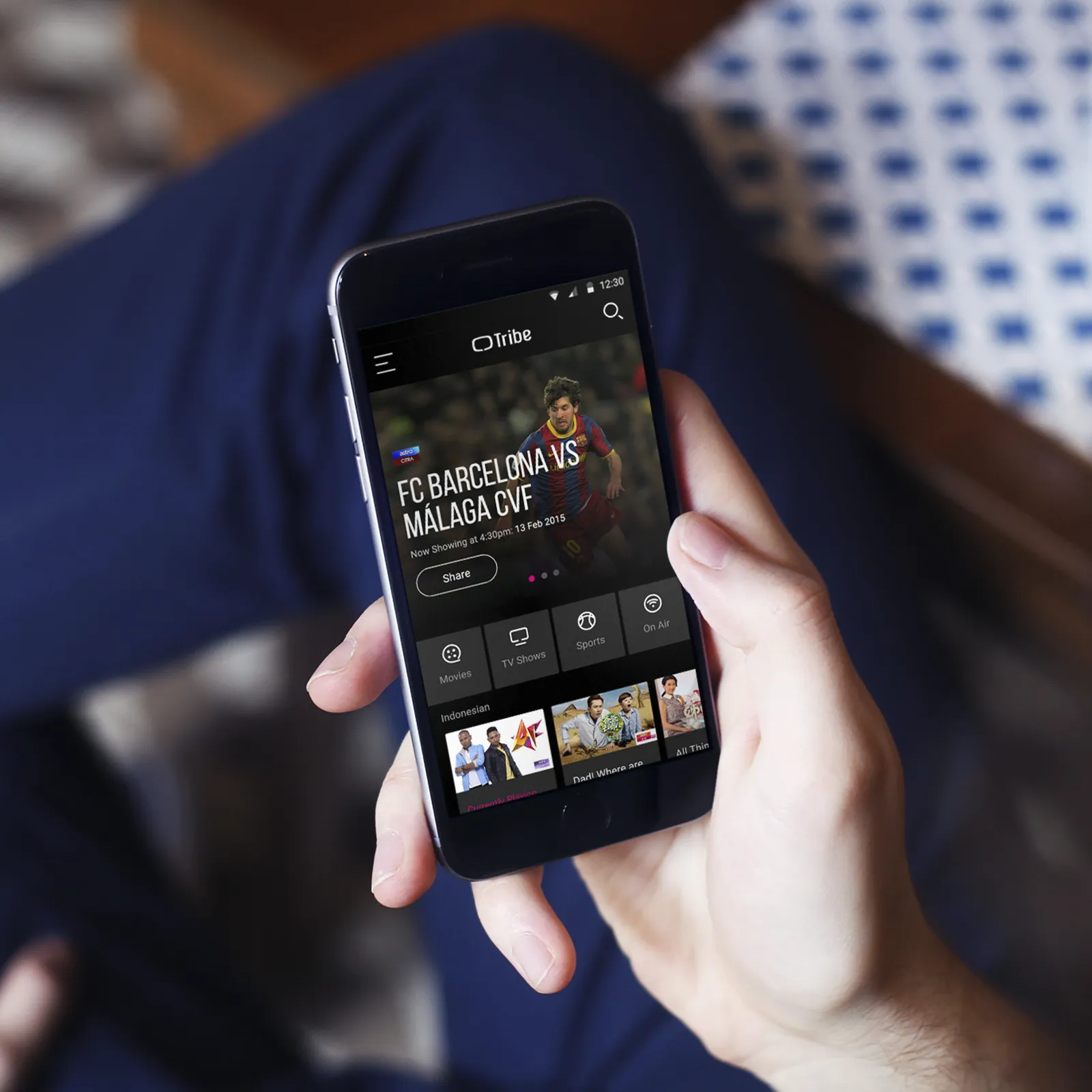
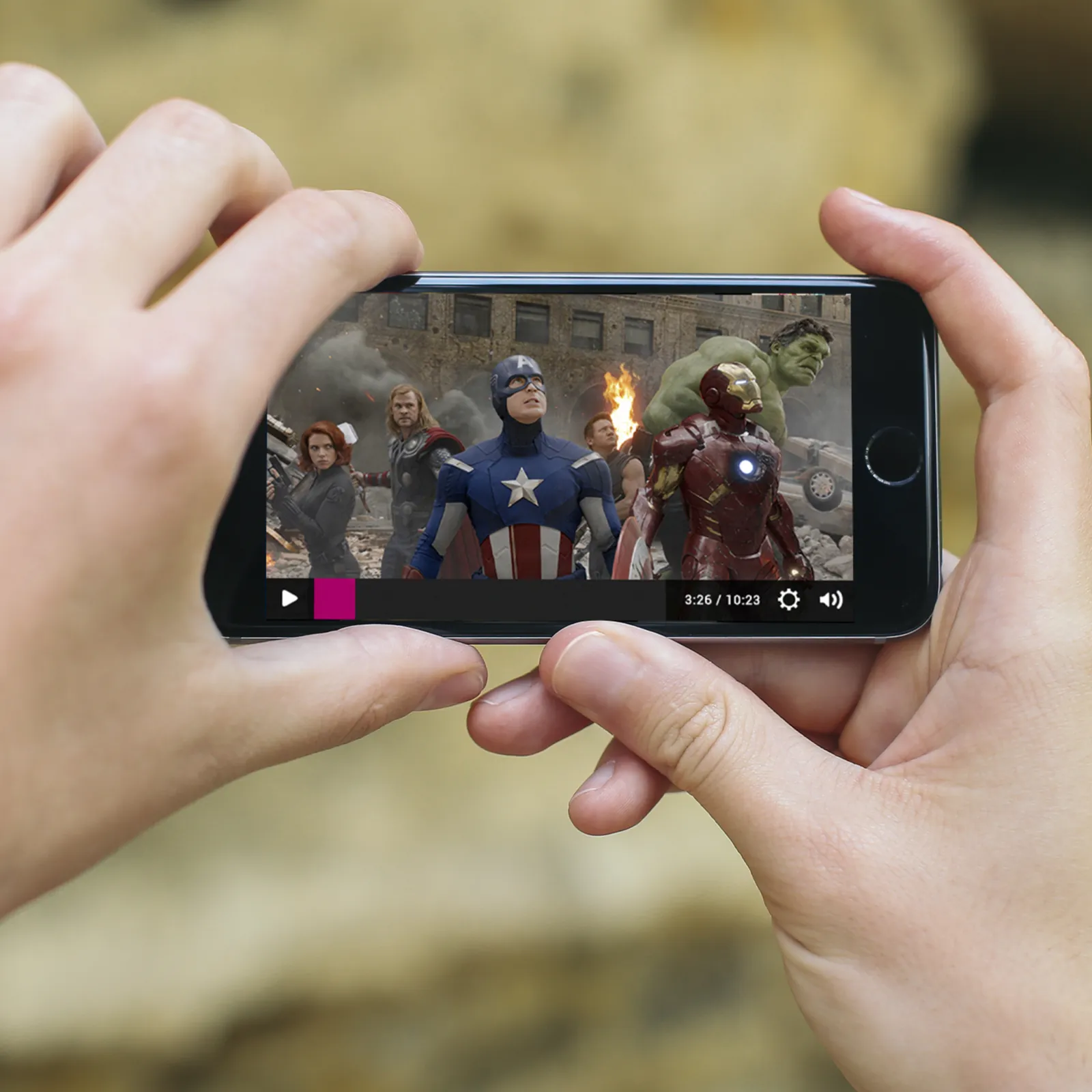
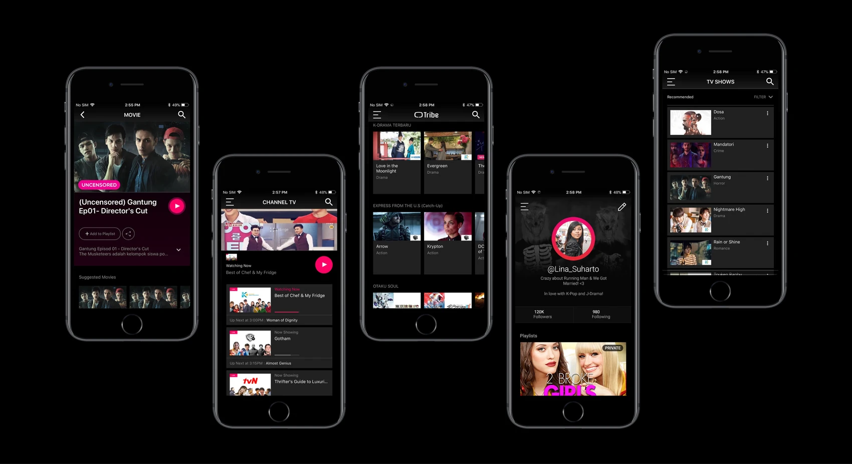
The interface had to feel native whether you were standing on a train with a phone or stretched out with a tablet. We designed home, browse, profile, and playback to flex across form factors while keeping the same dark, energetic identity.
One system, every surface
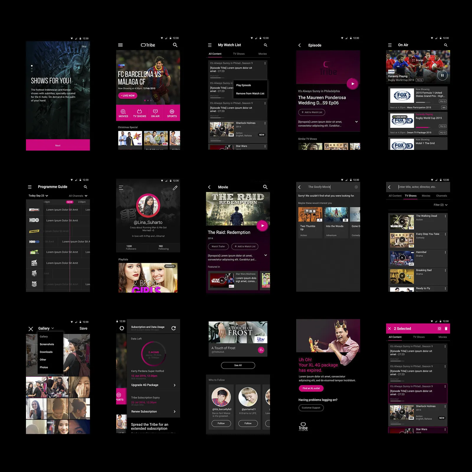
From onboarding and the programme guide to search, watchlists, and account management, every surface was designed as part of one coherent system, sharing structure, patterns, and behaviour.
Structure before style
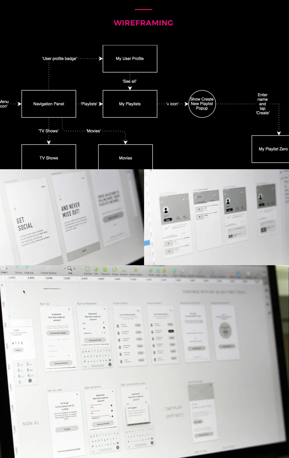
Before any visual design, we mapped the navigation and key journeys, sign-up, building a playlist, following friends, then worked through them in low-fidelity wireframes to pressure-test structure and flow.
One design DNA, four products
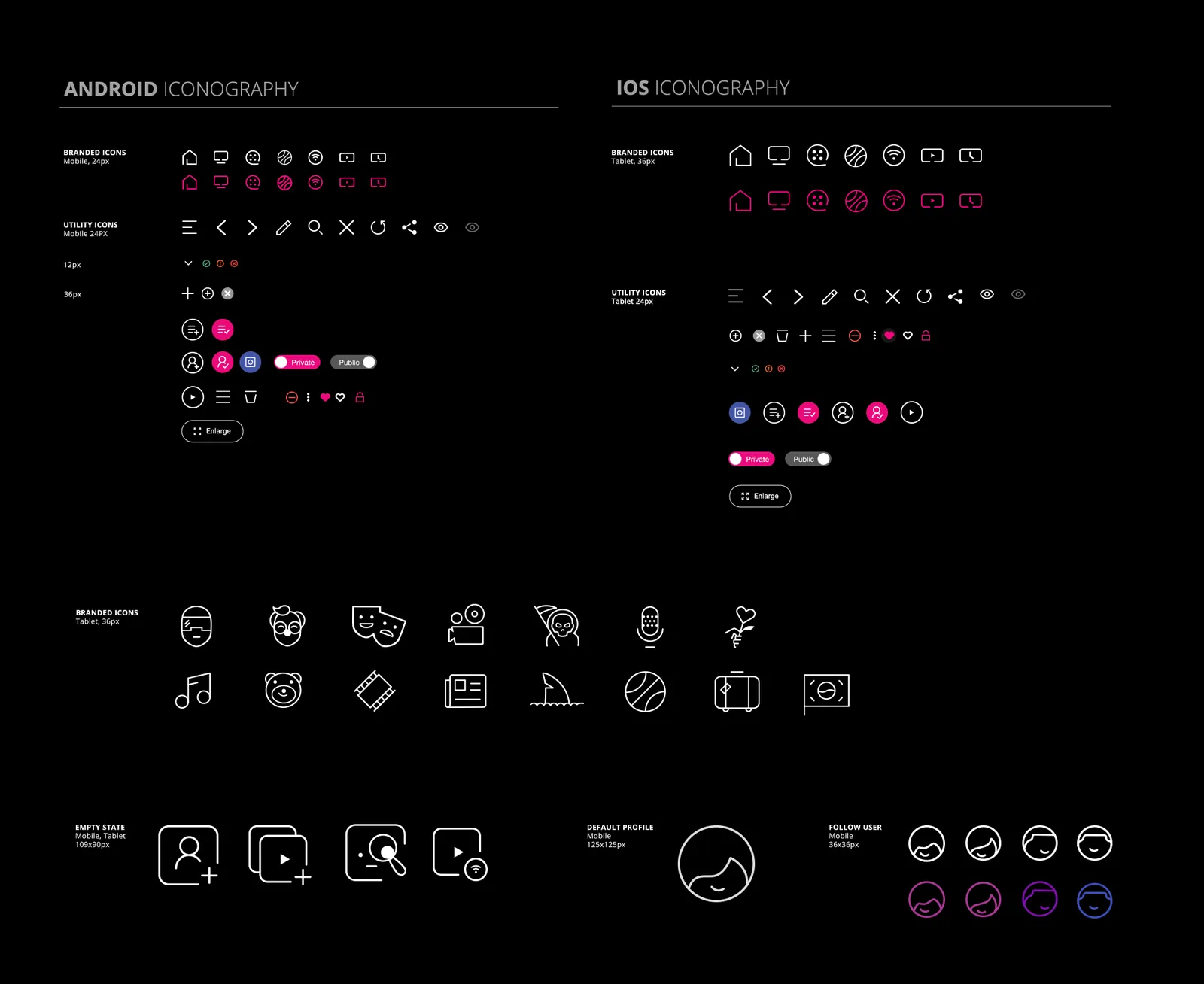
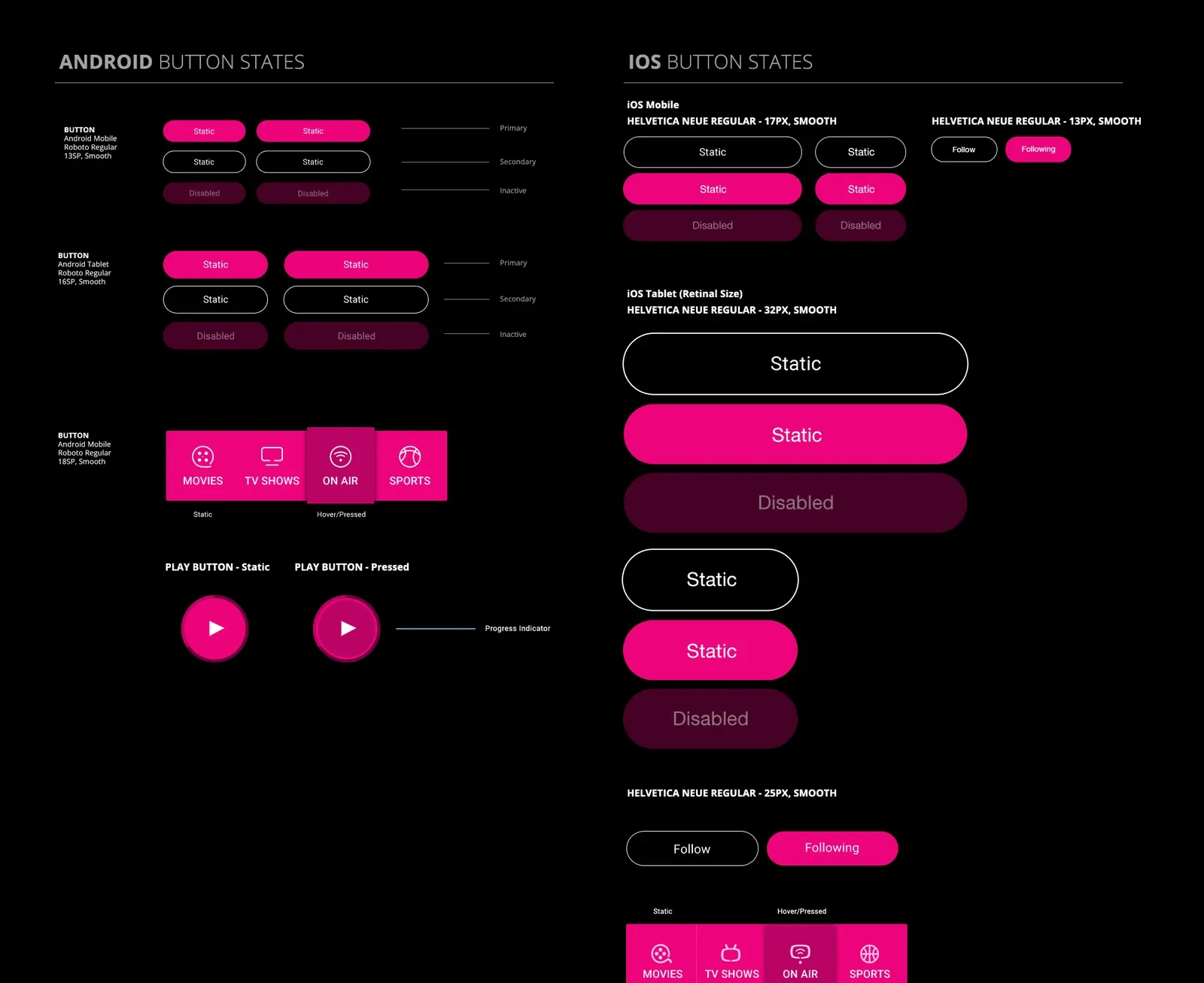
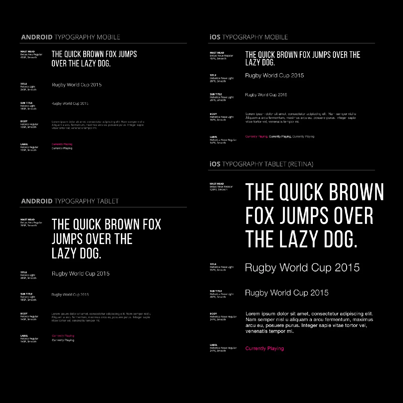
Tribe ran on a shared design DNA spanning four products, so every experience felt unified and uniquely Tribe. We documented iconography, button states, and typography for both Android and iOS, at mobile and tablet sizes, the connective tissue that let the product ship fast and stay consistent.
Made for live sport
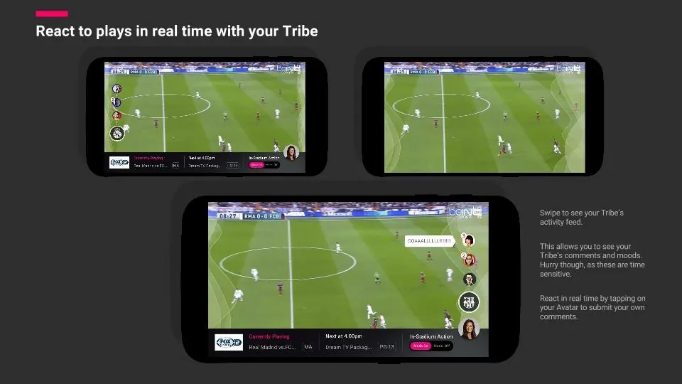
Live matches are where the social idea came alive. Choosing a team to cheer for puts you in a Tribe and connects you to others in your network watching the same game.
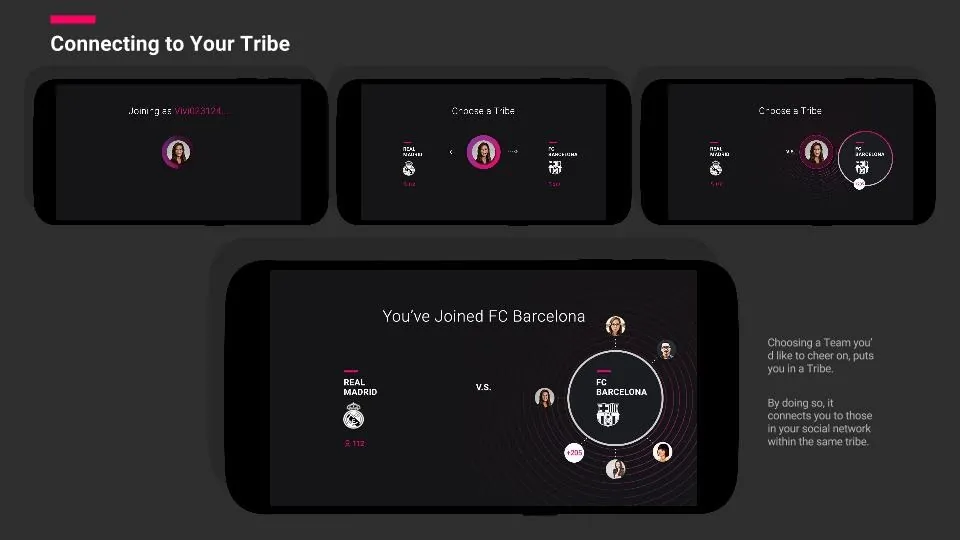
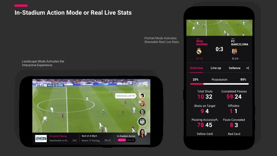
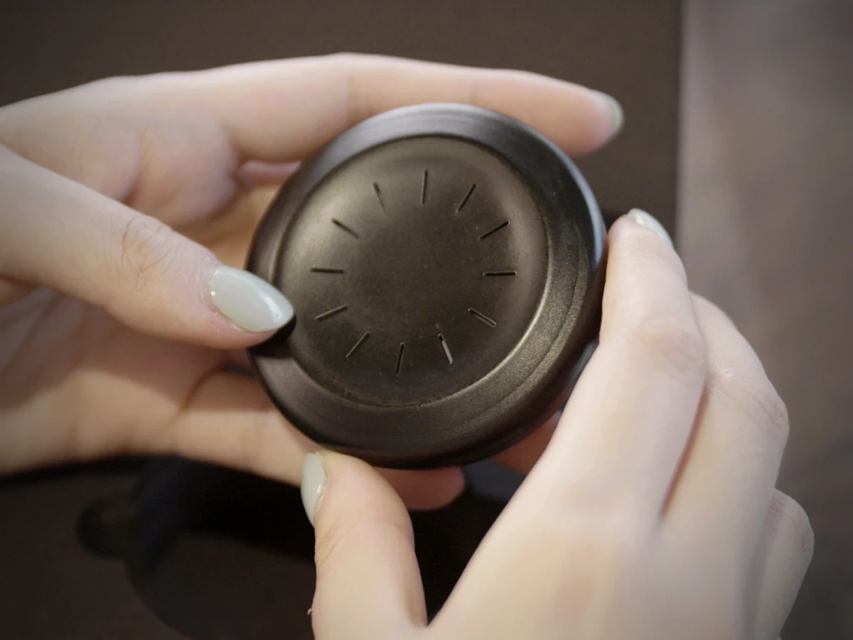
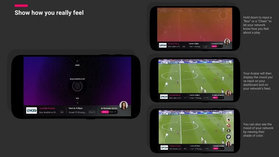
Hold down to send a Boo or a Cheer, and your avatar shows the mood to your network, so the room reacts together, even when everyone's apart.
Trade-offs
We doubled down on the two flagship features, Korean drama and access to live sports, instead of spreading across a big catalogue. A larger library would have looked better on paper, but it would have hidden the two things this audience actually came for.
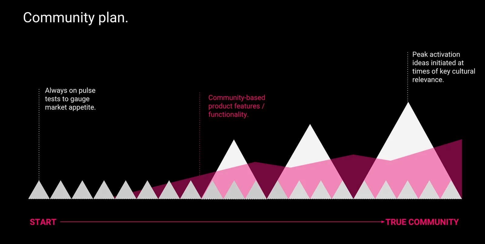
The harder call was the social layer. The most ambitious idea was a crowd-sourced, interactive live experience, haptic feedback that let fans send a Boo or a Cheer and feel the crowd react in real time. It was the part everyone was most excited about, and the least proven.
We tested it too late. We validated the social idea in research but didn't put the real flows in front of users soon enough, and the sports haptic prototype didn't pass the alpha cohort. So we shipped by doubling down on the flagship content and kept the interactive experience light, rather than betting the launch on a feature we hadn't proven.
Results